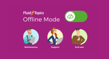
Whether your users need to access content on the road, in a cave or on Mars, Fluid Topics has your back. It offers the same great user experience on smartphones or tablets, online or offline.
How We Provide a True Mobile Experience
Great UX on any Device
The Fluid Topics UI is fully responsive and optimized for a native mobile user experience. It uses the Single Page App paradigm, adapts to the size of any device and improves rendering by applying CSS based on screen dimensions.
Smart Offline Mode
Use the same Fluid Topics portal to read content both online and offline thanks to Progressive Web App technology. Whether you want to limit your data usage or are working outside of your network coverage area, your reading experience is consistent and seamless.
Select the Content that You Need
The Collections functionality lets you create, sync and manage content right on your device. With a single click, collect the content you need before heading off the grid or out of range. Content updates refresh automatically with your next sync.
Explore More Fluid Topics Capabilities
No Software, no App to Install
Progressive Web App technology means that you don’t have to develop, maintain and submit custom apps to multiple app stores
Adapted to Your Brand, Look, and Feel
Brand your portal, and your app will automatically align to your look and feel
Go Offline and Stay in the Loop
Capture user interactions with your content, even when devices are offline – they’ll sync later, and you won’t miss out on anything


